 Left behind
Scroll to unbox the story ↓
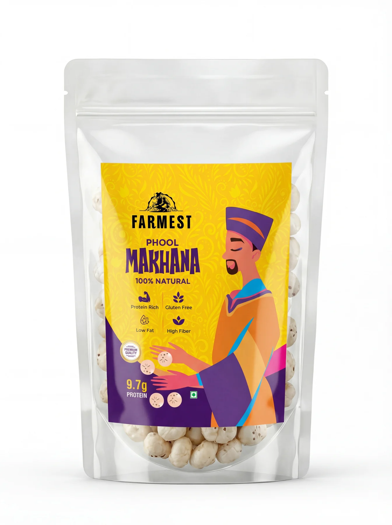
It started as a pouch.
A transparent pouch, too close to everything else in the category. It never went to print.
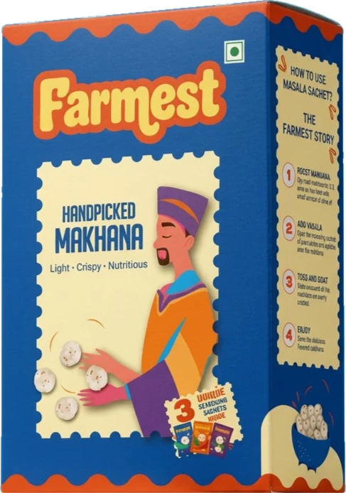
It became a box built to stand out.
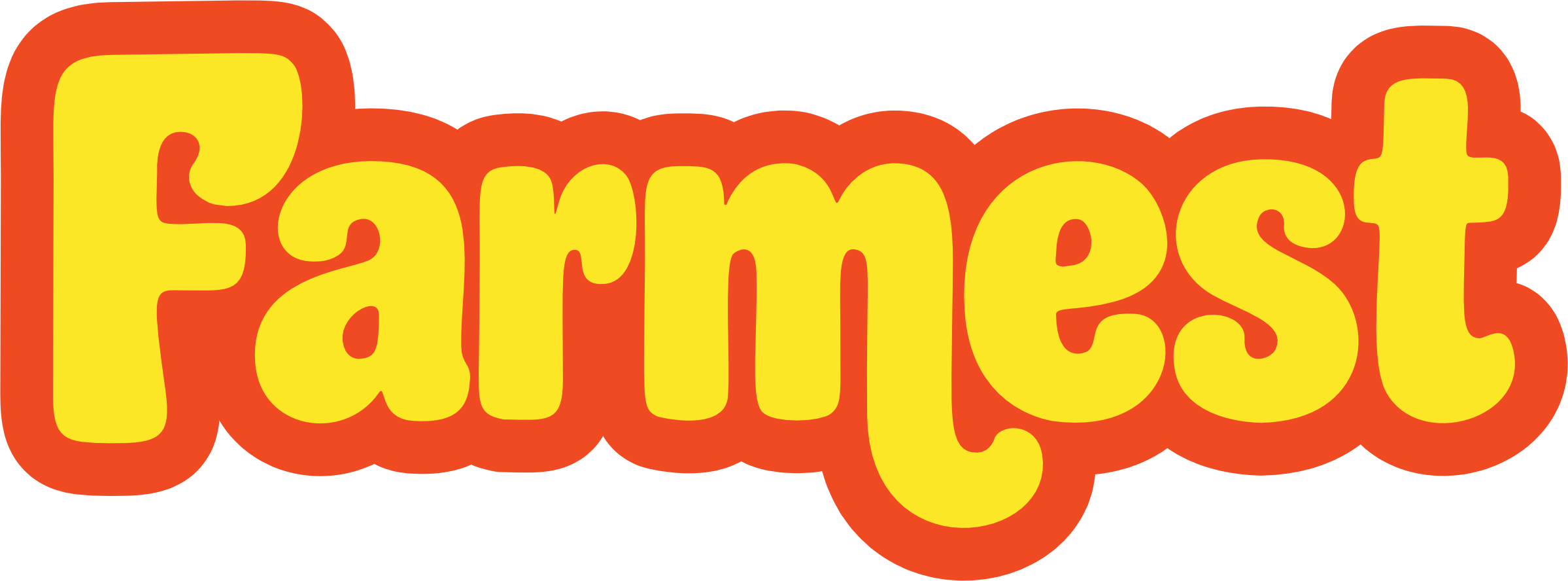
A custom-drawn wordmark, a bold palette and room to tell the story, made for quick-commerce shelves.
From scratch
The project
Farmest is an Agra-based makhana brand preparing for quick commerce. The brief began with packaging; my work grew to the identity, logo, box artwork, dielines and a website.
Bold, playful, recognisable.
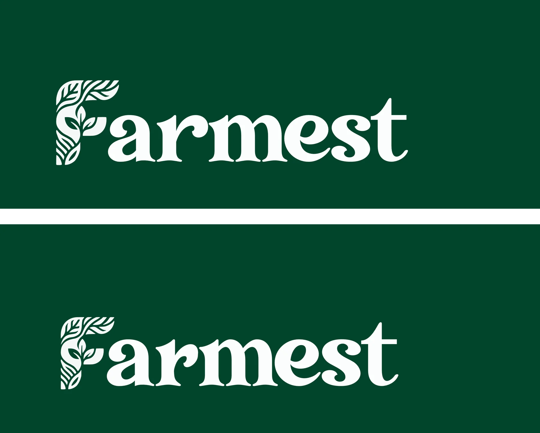
From a leaf-inspired green logo to a custom-drawn yellow-and-orange wordmark that feels current for a Gen Z audience.
Keep scrolling →
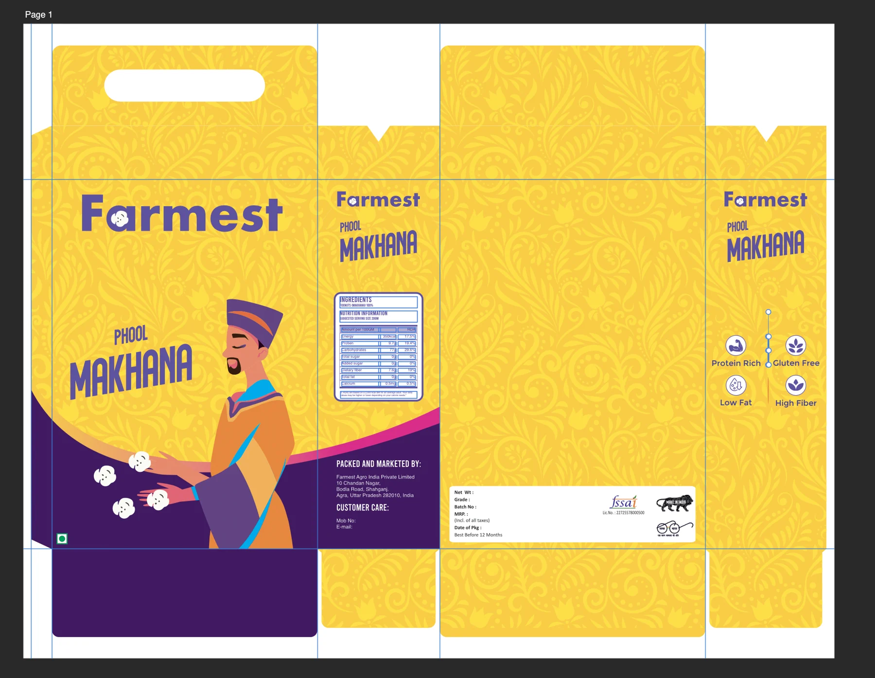
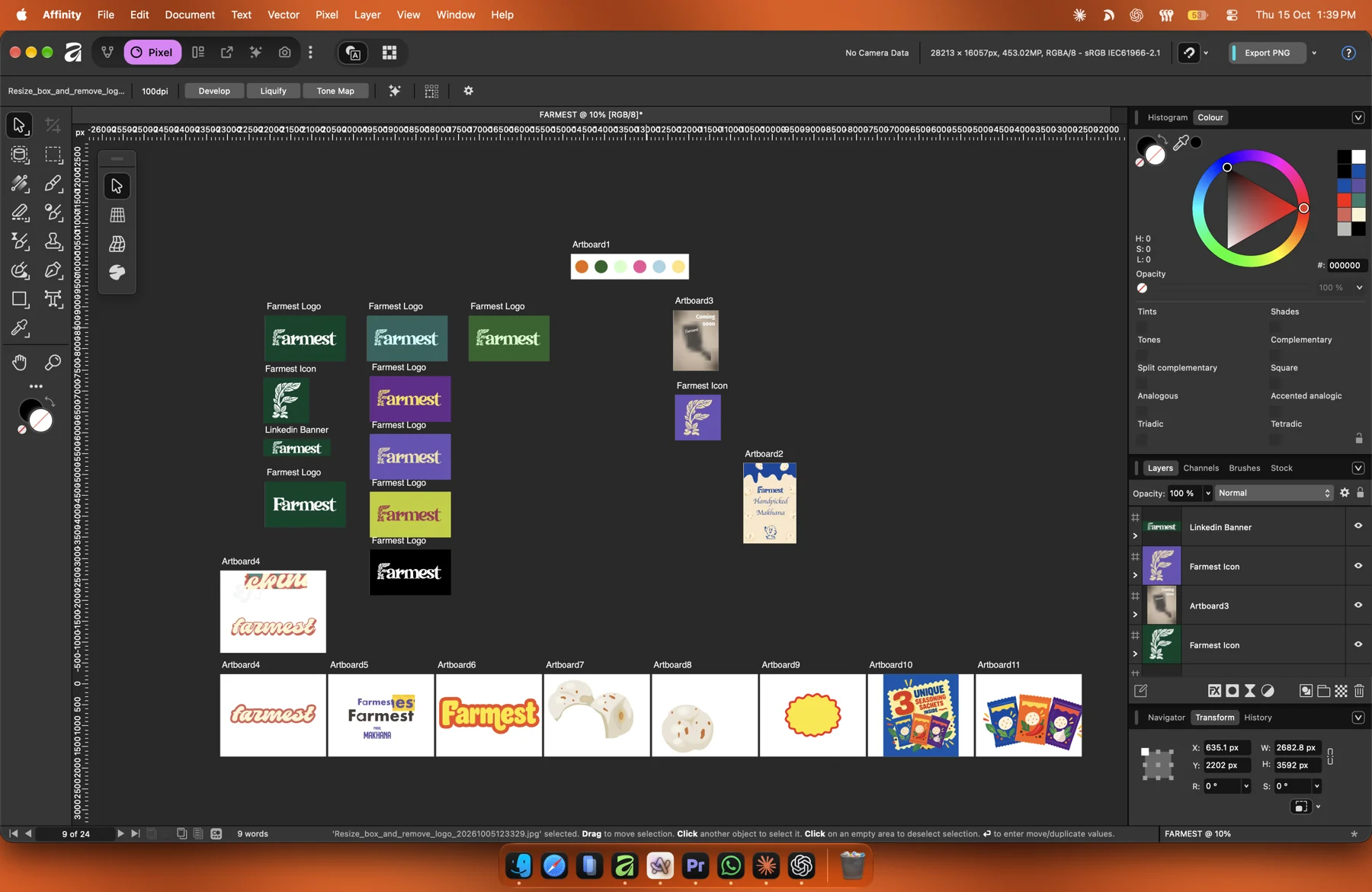
✎Kept the client’s character, recoloured and retraced as vector artwork.
▢Stamp-shaped panels group information on the box.
〰Wavy borders carry the playful character around it.
The screen wasn’t the final test.
A coral version looked promising on screen, but the printed sample felt too bright. Flip the switch to feel it.
people gave informal feedback
on appearance, not a sales study
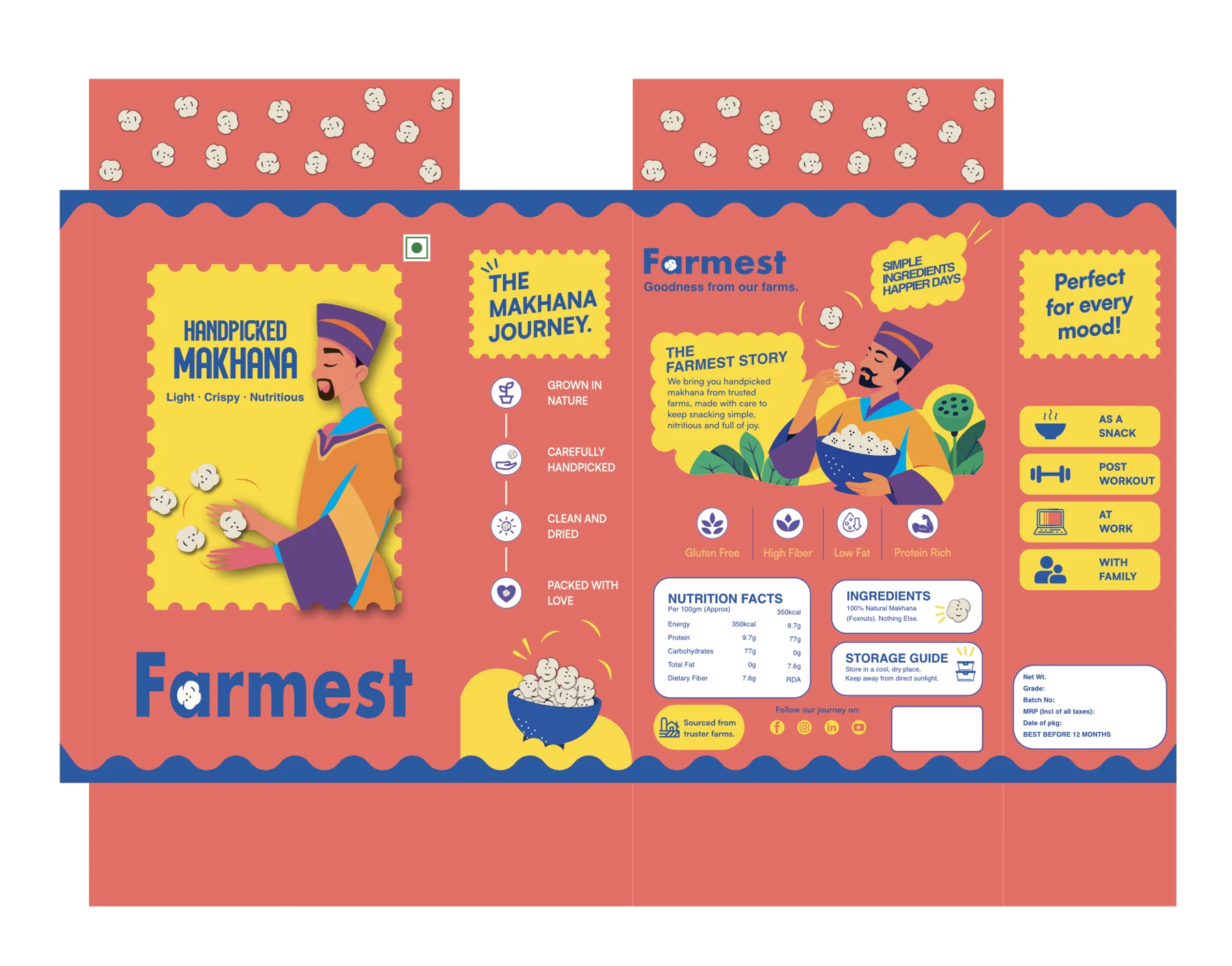 On screen
Simulated: “In print” exaggerates the brightness people noticed.
What people said about the blue version
One box. A clear visual system.
Blue, cream, orange and yellow bring the wordmark, character and information panels together.
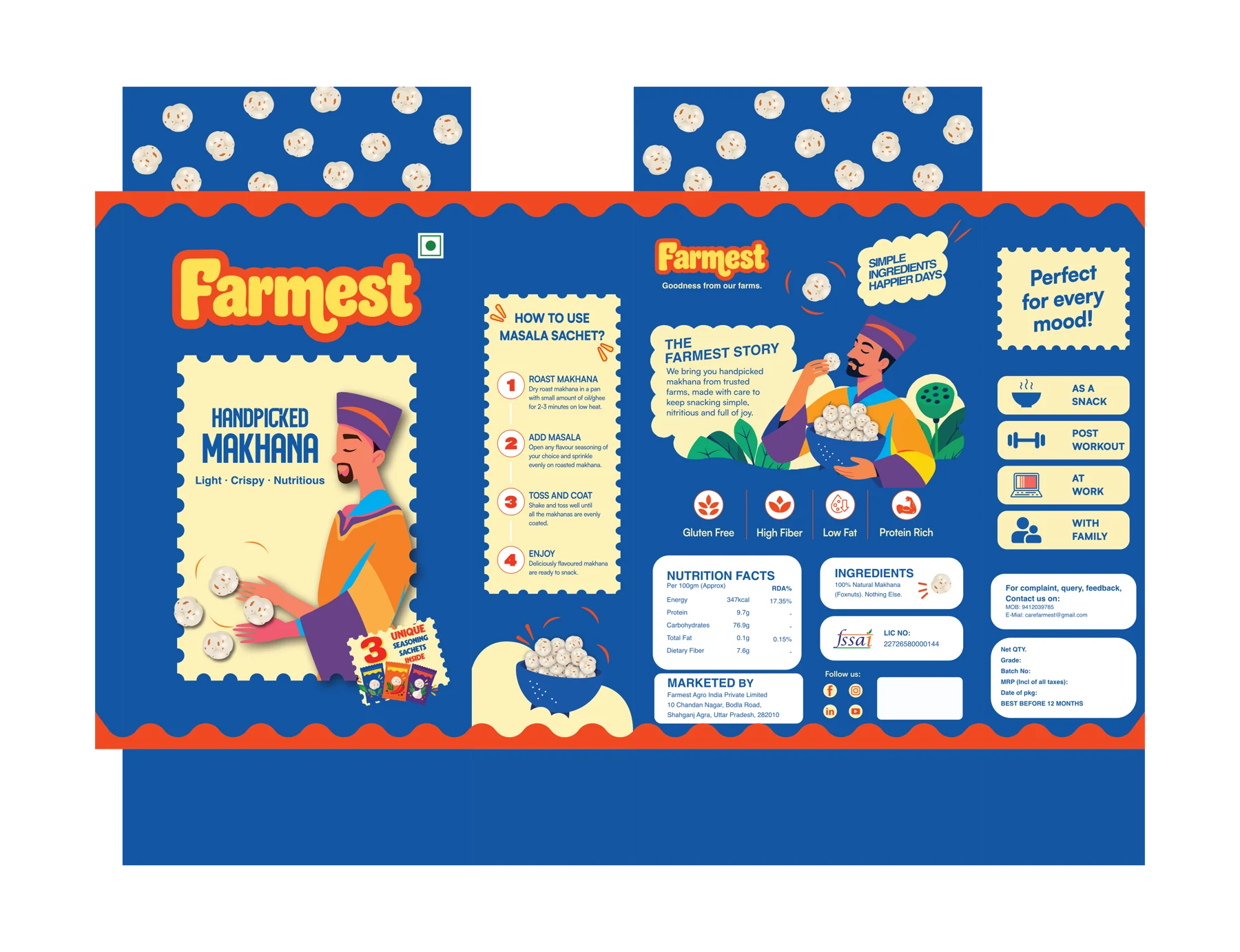
Four steps, printed on the side of the box
Roast
the makhana
Season
with a sachet
Toss
to coat
Enjoy
straight away
From the box to the browser.
A single-product brand site with a scrollable video that shows how to use the seasoning sachets. Online shopping isn’t connected yet.
Explore the website in progress ↗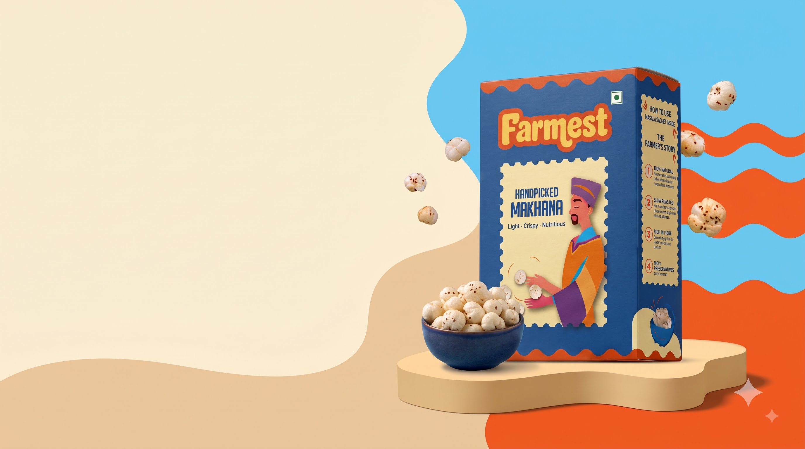
Ready for its next chapter.
The packaging is being printed after physical checks and informal feedback. Farmest is preparing for a quick-commerce launch.
Taking forward
A clear visual identity prevents delays and keeps the work consistent.
And
Print exposes weak points a polished screen hides.
AI supported illustration exploration, moodboarding and mockups. Finished-box scenes are AI-generated mockups.